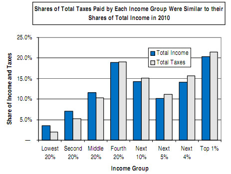
I thought this was an interesting presentation of data, from a column by Paul Krugman. Usually, when you see displays of percentage of taxes paid by income group, they show only shares of federal income tax, the only really progressive tax in the US. This display shows the percentage of all US taxes paid by income group, including payroll, local, state, etc. That’s the blue bars. The grey bars are also interesting–instead of just showing share of taxes by income group, this display compares share of taxes to share of income by income group. By this measure, it looks as if at the widest spread, total tax burden is only progressive by less than 5%. That is, even the top 1% of earners pay less than 5% more of total US taxes than the lowest 20% when their total share of income is taken into account.
July 5, 2011
Shares of Total Taxes Paid by Each Income Group Were Similar to their Shares of Total Income in 2010
Posted by Nathen under money, Paul Krugman, statistics, taxes[2] Comments

July 6, 2011 at 7:21 pm
Very interesting. If the research is solid, it seems like a positive finding to me, and a big plus for progressive federal income tax brackets.
It’s still amazing that 40% of federal income tax is paid by the top 1%.
July 7, 2011 at 8:31 am
I wanna see the baby Reanna slide show!!!