statistics


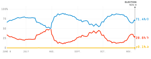
Like many people, I looked at Nate Silver’s model for the presidential election outcome daily for the last six months. I hoped it would calm me down. It didn’t. I was not calm because his model was predicting somewhere between pretty close and extremely close the whole time, unlike during the 2012 election. Here’s what it looked like on election day–the blue line was the probability that Hillary Clinton would win and the red line was the probability that Donald Trump would win:

538-graph-election-day

A lot of people seemed to have looked at this and decided that Trump had very little chance of winning. That’s not what it says at all, and I think this points to a problem with our math curricula.

We could and should but do not have any kind of grasp of probability by the time we graduate high school. We need the education, because our brains have trouble taking base rates adequately into account. (See the second blurb here for a little more information.) We spend a lot of time learning algebra, which is for a normal person useful only for internalizing arithmetic and for the general brain workout, but we spend almost no time learning about probability. So we have an electorate swung in part by those living in genuine fear of being killed in a terrorist attack, which is a near-zero percent probability, and by those who were blasé about Trump’s chances of winning.

Basic probability is not hard to learn. Any teenager of average intelligence and a week of Dungeons & Dragons under their belt could have told you that Trump could easily win the election. The worst his chances ever got were about the same as rolling a 1 on an 8-sided die. It’s not great odds, but you don’t bet the life of your character on it, much less the fate of your whole game. And that’s the worst it got. It looks like he averaged around the chance of rolling a 1 on a 4-sided die. That happens a lot. Give it a try.

I’d love to see algebra classes replaced entirely by statistics classes, but I’d settle for replacing the first two weeks of Algebra I with an intro to dice gambling. The idea that knowing how to factor polynomials is more important than a real grasp of probability is hurting us.

My wife Reanna was ambivalent about owning her first car, largely for reasons of environmental ethics. So when she got one she started reading about “hypermilers,” a group of people developing driving techniques to increase gas mileage in their vehicles.

I’ve been interested, of course–this is right up my alley–but have little time for reading these days. Here is the only hypermiling post I’ve read,which is quite good. Mr. Money Mustache, a financial blogger, monitors his miles per gallon, gallons per hour, and other information like engine temperature in real time while he drives. He uses a bunch of driving techniques, and averages 44 MPG in his Scion (rated at 27 MPG) in city driving. Some highlights from the article:

“‘If you have to brake, you’ve made a mistake’…. [P]retend [your brakes] are hooked up to a speaker on your dashboard which blares out my voice saying ‘MEEEEEEEHHHHHHHHHH!!!’ at you for the duration of your brake application….”

When you decide to drive 75 MPH, sing this song in your head: “I am Mister Fancy, I am in a hurry, my time is so valuable that I am wasting gas. Wasting gas, wasting gas, look out world I’m wasting gas. Tomorrow I will save some gas, but today I’m wasting gas”.

On the use of air conditioning: “Is it dollar-an-hour hot in here today, or not?”

Reanna started tracking her by-the-tank gas mileage right away, using Gas Cubby, so we have a record of the MPG for every tank of gas we’ve put in. Lately I’ve been driving it the most, so I decided on an experiment based on Saul Griffith’s (which I wrote a bit about and linked to here):  I drove a full tank with an self-imposed speed limit of 60 MPH and then a tank at 55 MPH max. There are 65 and 60 MPH speed limits posted for parts of my normal commutes, so these new limits affected a significant amount of my driving–maybe a third? So to be clear, I drove normally for me (which does not include hypermiling techniques, for the most part) unless the posted limit was above my imposed new limit, when I would drive at that speed.

Hack display of 29 tanks in our 2-door Toyota Yaris. The X axis is MPG.

Sorry about the hack display, but I think it gets the point across. Each dot is a tank and bigger dots mean more tanks at that MPG. The tank with a 55 MPH speed limit was the least efficient driving, at 32.5 MPG and the tank with a 60 MPH speed limit was the most efficient, at 40.8 MPG. I really did not expect this. I expected 55 to be more efficient than 60 and I did not expect a limit of 60 to make much of a difference.

Some complications to consider: 1) It is winter right now, and we are not using air conditioning, while many of these tanks supplied energy for significant AC use. And colder engines are less efficient. 2) I was not perfect and exceeded by self-imposed speed limits accidentally, off and on. Also, I drove 10-15 minutes of my 55 MPH tank at posted speed limits of 60 and 65 because I had something time-sensitive to deal with while my mom was in the hospital. 3) Reanna drove the Yaris 25-30% of these tanks, and she is a congenitally slow driver, rarely exceeding 55 MPH.

And a note about the psychology of driving slower than a posted speed limit: I was surprised at how embarrassed and defensive I felt while driving slowly on the highway. It breaks a social norm that I didn’t often notice: Driving slower than a posted speed limit is deviant. You will drive as fast as you are allowed, if not faster. It reminded me of when, because of a back injury while a student at the University of Oregon, I started standing in the back of the class during lectures. I realized that no one stands during lectures or meetings, and it really sticks out when someone does, regardless of how harmful sitting is.

I posted yesterday about Cool Climate Network’s interactive maps, where you can find find and compare average carbon footprint and average annual vehicle miles traveled by zip code in the US.  I tried in that post to compare the carbon footprints I had calculated here and here to Cool Climate Network’s averages for Joshua Tree, with muddled results because of the variation in carbon footprint numbers each calculators gave me. Today I realized that Cool Climate Network has their own carbon footprint calculator, so I tried it out. I figured I might be better off comparing my carbon footprint to Joshua Tree’s average if they were calculated by the same people.  Who knows, really? I’d love to do a full and convincing inventory, like Saul Griffith in his Long Now talk. Perhaps once I’m licensed…

Cool Climate Network’s carbon footprint calculator is pretty similar to the other three I’ve tried (Carbon Footprint, Nature Conservancy, and Global Footprint Network), but on the simple side. It took about ten minutes. Here are the results:

Cool Climate 2013 Estimate

A total carbon footprint for both Reanna and me of 19.7 tons of CO2 in the last year is “59.9% better than the average household in the United States with 2 people and similar income.” It’s also 55% of the 35.8 tons of CO2 they estimate for average in Joshua Tree. I wonder why they match by income. What I’d really like to know is  our number of standard deviations from the Joshua Tree, US, and worldwide average: where we are on those Bell curves.

Beneath these results, Cool Climate Network lists 41 ways to decrease our carbon footprint, mostly things that the survey did not ask about. We’ve done about 20 of them already, though some we could do more of.  This is another way a more detailed calculator would be better. Those 20 things we’ve done already add up to about 6 tons of CO2, so it may be that our actual footprint is more like 14 tons of CO2.

These images are from three interactive maps of the US at Cool Climate Network:

JT Average Vehicle Miles

(Joshua Tree in red oval)

Reanna and I drive our Yaris about 1,200 miles a month. That’s less than 40% of average if what they mean is how many miles individuals are traveling in vehicles per month. They could mean how many miles each vehicle travels per month, though, which places us at 75% of average.

JT Average Energy Carbon Footprint

(Joshua Tree in red oval)

JT Average Carbon Footprint

(Joshua Tree in red circle)

I tried out a three carbon footprint calculators (and wrote about it here and here) in 2012, which produced estimates of 10.41, 13.7, and 17 metric tons of CO2 for me. That makes it look like Reanna and I were somewhere between average and 2/3 of average, which I doubt. I bet we’re at half or less of Joshua Tree average–we live in a very small space with solar-generated electricity, don’t spend much money, and drive a fairly efficient vehicle–but I can’t prove it without a really good, thorough carbon footprint calculator. Can anyone recommend one?


I’ve been enjoying how incarceration rates, politics, and alternatives are dominating the news today. I don’t follow this conversation closely so it’s been good to see some numbers and hear the different perspectives.

When I first started listening, last night, I heard the numbers presented as totals on CNN, like this list from the International Centre for Prison Studies:

1 United States of America 2,239,751
2 China 1,640,000
3 Russian Federation 686,200

That probably shouldn’t have surprised me, but it did. But, I thought, the real question is how dangerous do we think we are compared to other countries. Or, perhaps, how evil do we think we are…

So I looked up the incarceration rates per capita, which, to be fair to the media, is how almost everyone is displaying the data. Here are the same countries (Plus Canada. My wife is Canadian so I like to make comparisons between the US and Canada.) picked out of a chart on Wikipedia:

Rank Country (or dependent territory) Prisoners per
100,000
population
1  United States 716
8  Russia 484
124  China 121 or 170[2]
133  Canada 114

Apparently, here in the land of the free, we consider each other somewhere between 4 and 6 times as dangerous as they do in that repressive regime, China. And well over 6 times as dangerous as Canadians consider themselves. What do you think, Canadians? Are you 1/6 as dangerous as we are?

The WordPress.com stats helper monkeys prepared a 2012 annual report for this blog.

Here’s an excerpt:

4,329 films were submitted to the 2012 Cannes Film Festival. This blog had 39,000 views in 2012. If each view were a film, this blog would power 9 Film Festivals

Click here to see the complete report.

I posted earlier about my first carbon-footprint calculation attempt, on carbonfootprint.com and thought I’d try another couple calculators to see how they compared.

First, I tried The Nature Conservancy‘s calculator. They gather a lot less detailed information than carbonfootprint.com, but also ask some new questions, like how often I check my truck’s air filter and tire pressure. They also have a way to be clear that I’m getting my individual carbon footprint, not that of my household, which was not so clear with carbonfootprint.com. They calculated my carbon footprint as much bigger than carbonfootprint.com, though, at 17 metric tons of CO2 per year: 17.8% on home energy, 64.6% on driving and flying, 2.8% on waste and recycling, and 14.9% on food and diet.

They also provide an opportunity to offset my entire carbon footprint and calculated the cost for me to do was $255: $15 per metric ton. That’s pretty cheap. I’ll have to look into carbon offset schemes and see if they are convincing.

Second, I tried footprintnetwork.org. They try to calculate how many planet earths it would take to support a population living my lifestyle–an interesting way of thinking about it. They gather a lot of the same information as the other sites, like how local is my food and how much I fly and drive. In some areas they gather more details, like how often I eat each of several kinds of animal products, how often I buy new clothes, furniture, appliances, and computer gear, and what kind of siding my house has.

This site estimates that if everyone lived like I do, we would need 3.5 planet Earths to sustain us. They suggested several ideas that would decrease my footprint: .1 of an Earth if I half my animal product consumption, .2 of an Earth if I “pledge to use less packaging,” .1 of an Earth if I use public transportation once a week, and .1 of an Earth if I do not fly this year because I chose “a local vacation.”

If I did all of these things we would need only three Earths to sustain us all at my standard of living. Half of an Earth’s savings is nothing to scoff at, but doesn’t really get us there. Plus, I already use very little packaging, and do not often fly for vacations.

They estimate how many “global acres of the Earth’s productive area” my lifestyle requires:  7 acres “energy land,” 2 acres “crop land,” 1 acre “grazing land,” 2.5 acres “forest land,” .5 acres “built up land,” and .25 acres “fishing grounds.”

They also calculate my “ecological footprint” percent by category: 52% in services, 11% in goods, 12% in mobility, 4% in shelter, and 16% in food.

Something is wrong about these calculations, but I’d need more details to know what. Half of my land-use is for energy, but half of my footprint is in “services.” What are these services that are using so much energy?

Still, a picture emerges. I have estimates of 10.41, 13.7, and 17 metric tons of CO2 per year, approximately 3-5 times as much as an ethical target. I probably create the most CO2 by burning fuel, driving and flying.

WordPress sent me this in an email. Last year they let me post the whole summary (here) but this year it’s just an excerpt with a link to the rest of the information. Their summary this year is more interesting than last (including a map showing that, for example, 24.5% of my hits from Asia were from India), but it’s annoying that they are using this teaser to advertise some of their new features.

Anyway, happy new year everybody!

The WordPress.com stats helper monkeys prepared a 2011 annual report for this blog.

Here’s an excerpt:

The concert hall at the Syndey Opera House holds 2,700 people. This blog was viewed about 24,000 times in 2011. If it were a concert at Sydney Opera House, it would take about 9 sold-out performances for that many people to see it.

Click here to see the complete report.


I became aware of Google’s Ngram Viewer a few days ago when Reanna read me the essay “Isn’t the word “feminism” itself gender-biased?” The author used this image:

What? You can do that? Yes, you can, apparently. You can search the frequency of words in all of the books Google has digitized

This is really fun, but be aware that you can sink a lot of time into it. Here are a few randomy ngrams I made. Sorry, but you might have to zoom in to see the text. That’s control-plus for PCs and command-plus for Macs.

I thought this was an interesting presentation of data, from a column by Paul Krugman. Usually, when you see displays of percentage of taxes paid by income group, they show only shares of federal income tax, the only really progressive tax in the US. This display shows the percentage of all US taxes paid by income group, including payroll, local, state, etc. That’s the blue bars. The grey bars are also interesting–instead of just showing share of taxes by income group, this display compares share of taxes to share of income by income group. By this measure, it looks as if at the widest spread, total tax burden is only progressive by less than 5%. That is, even the top 1% of earners pay less than 5% more of total US taxes than the lowest 20% when their total share of income is taken into account.

Next Page »