While Nathen is away at Not Back to School Camp in New Hampshire, I, his lonely fiancé, am trying to keep myself busy and in good company. To that end, I moved in with some friends of ours, Nick and Tilke, for a few days.
While I was staying there, Tilke and I talked a lot about colour (or “color,” as I might start spelling it after I get my green card). Colour is a lifelong passion of Tilke’s, and she is in the midst of revising a book she wrote and illustrated on the topic as well as writing the syllabus for a workshop called Experiencing Color.

Tilke's backyard studio
While talking to her about her workshop, I started to describe my own challenges with colour: Since I started making quilts a couple years ago, I’ve struggled with figuring out how I want to put colours together and have realized how little confidence I have about colour. When I do hit on something I like, I mostly don’t know why it works. I described how a few days earlier I’d been in a fabric store trying to choose a few solid colours to buy: when I went for my favourites, the ones that caught my eye –fuchsia, emerald green and bright blue– they looked terrible together. When I tried to narrow my choice down to two colours that I thought of as complementary, the connotations seemed all wrong. I ended up leaving without buying anything.
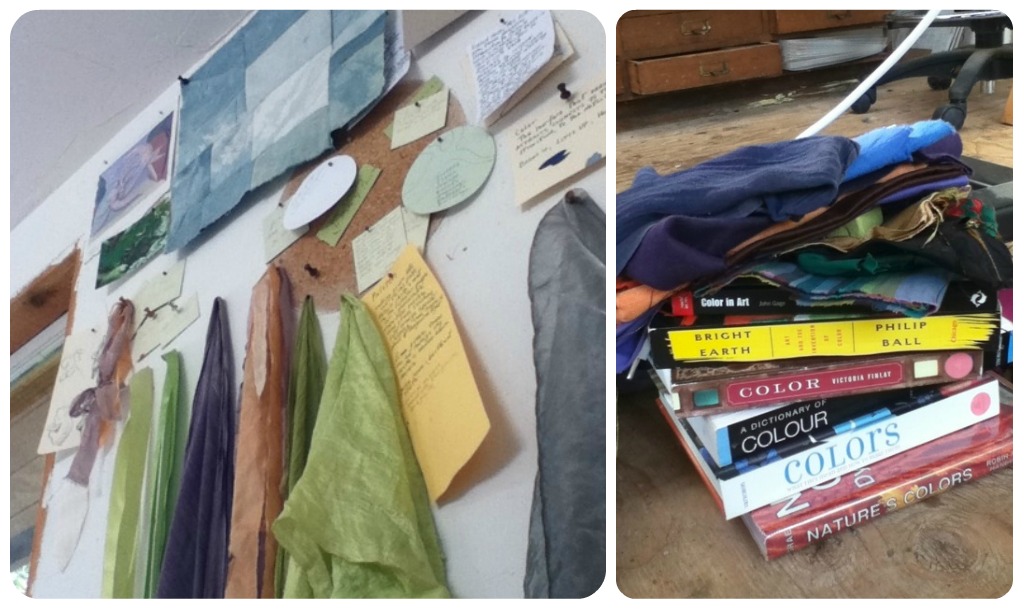
Plant-dyed fabrics, books about colour.
So here she was, someone trying to figure out how to teach people about colour, and here I was, a real, live colour novice with a hunger to learn. We went to look at her fabric stash and talk it out.
Tilke has a very distinctive colour palette that anyone who knows her would recognize, a family of colours she uses in her work and surrounds herself with. She described the way that certain colours in her family support or “bridge” other colours. I noticed as she moved fabric around that she mostly grouped her colours in sets of three or more. She agreed and showed me how adding a third colour can add a subtlety and depth that you can’t get with two colours.
I started to get a feel for what she was saying. I tried putting together my own set, choosing first a turquoise I liked and then adding another blue, a mushroom, a brown and an orange until – magic! – I had a group of colours that looked great together.
“What if you couldn’t have this one?” Tilke asked, and took out the orange. So I shuffled things around and brought in new colours until I had another set I liked. We talked about the importance of arrangement (which colours are beside each other) and proportion, looking at paintings and photos around her house for examples. Later we played a game with her new “colour library” of fabric samples, where we challenged each other to take the worst colours (eg: neon peach or drab burgundy) and make them beautiful by combining them with good supporting colours. Very fun!
I was so inspired that I started “editing” some patchwork pieces I’d sewn together a year ago that weren’t doing it for me: it suddenly seemed obvious which colours weren’t working, and taking them out made a big difference.

My quilt project, before and after colour editing.
We also had great talks and I got to try out throwing around medicine balls with them in the park (Ooof. My hands were too shaky to keyboard afterwards). It’s so fascinating to peer into – and join in on – other peoples’ lives like that. I’d like to do it again some time.

